Leiteria da Bocaina
Rebranding and packaging for an artisanal cheese producer, built from the windows of the town.
Client:
Leiteria da Bocaina
Categories:
Identity & Branding
,
Packaging
Context
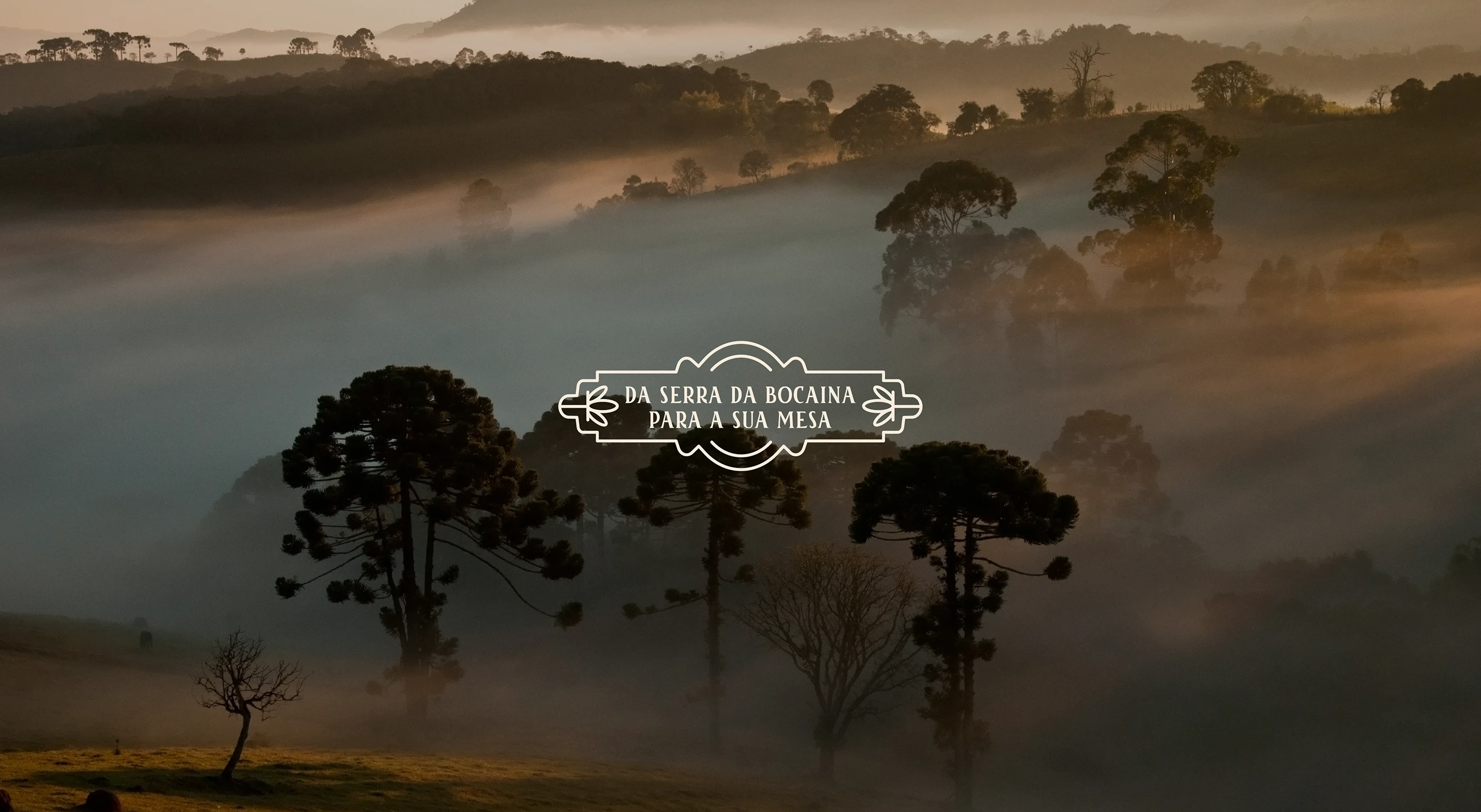
Leiteria da Bocaina makes cheese in Areias, a small town in the Serra da Bocaina, in the interior of São Paulo. The production is artisanal and slow, the kind where the same family handles every stage. What they had was a product people already loved and a brand that did not look like the thing inside the package.
Challenge
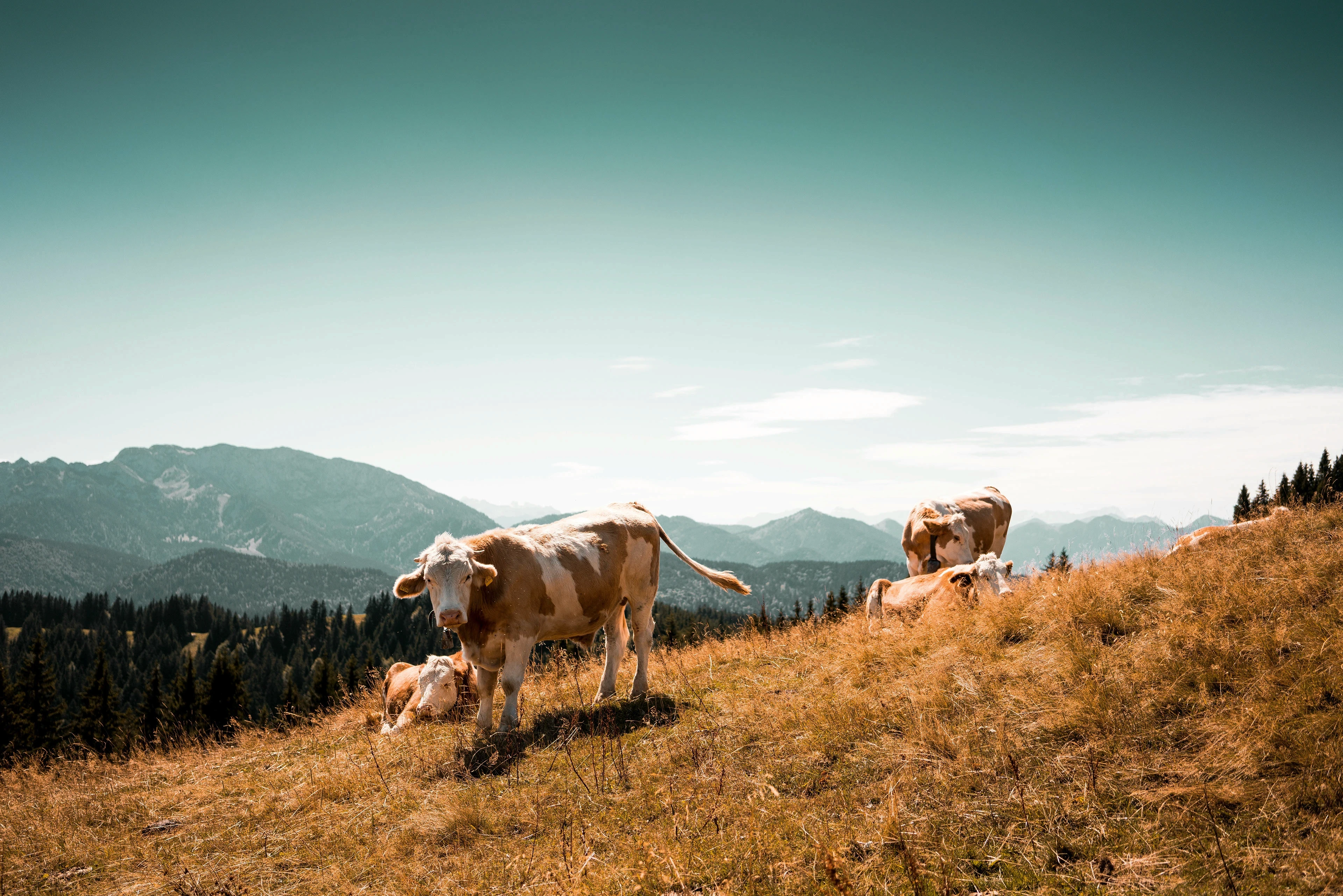
Artisanal food brands tend to fall into one of two traps. They either look so rustic that they read as amateur, or they modernize so hard that they lose the reason anyone wanted them in the first place. This one needed both at once: the weight of something made by hand, and enough presence to hold its own on a shelf next to industrial competitors.
Approach
I went looking for the place before I went looking for the brand.
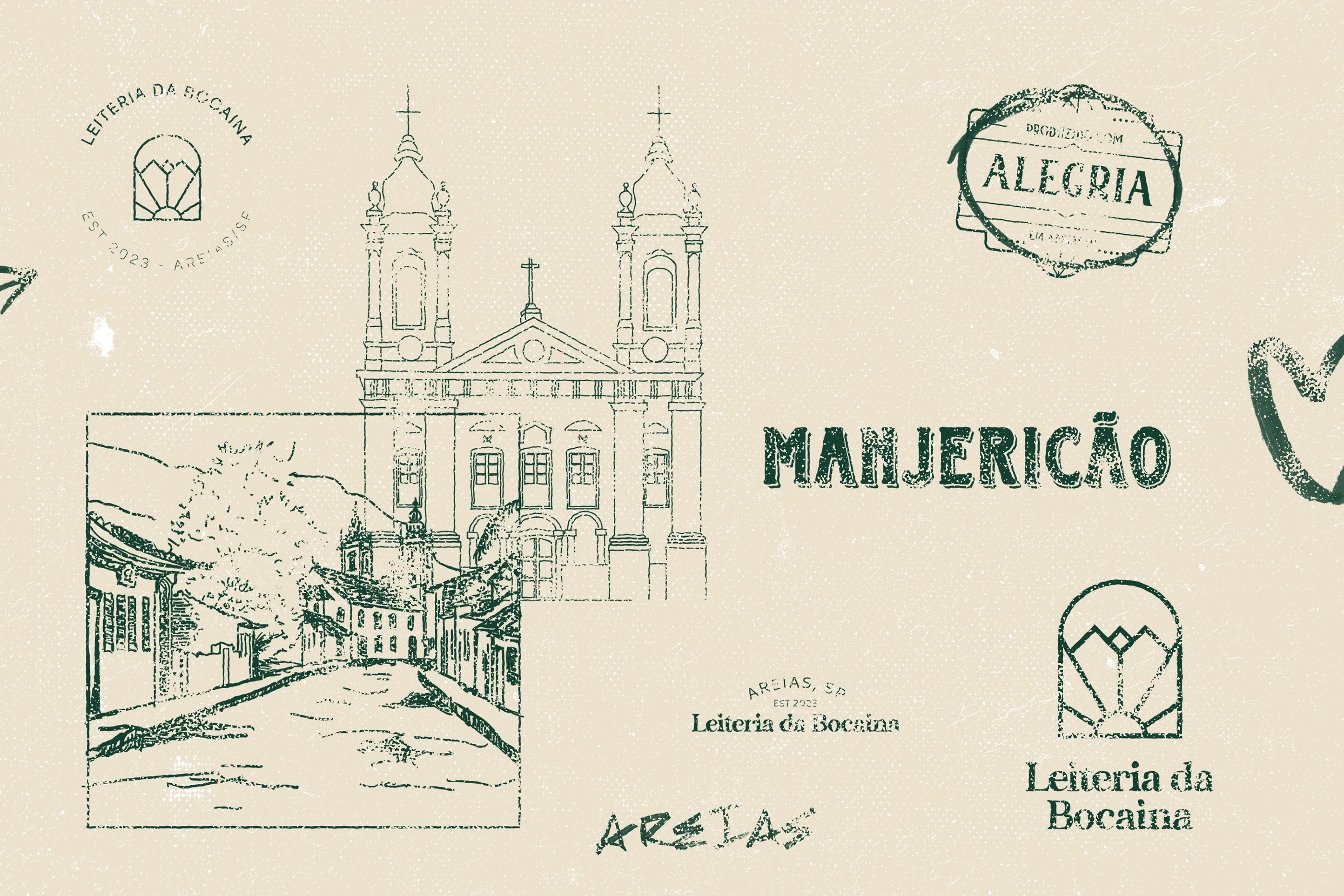
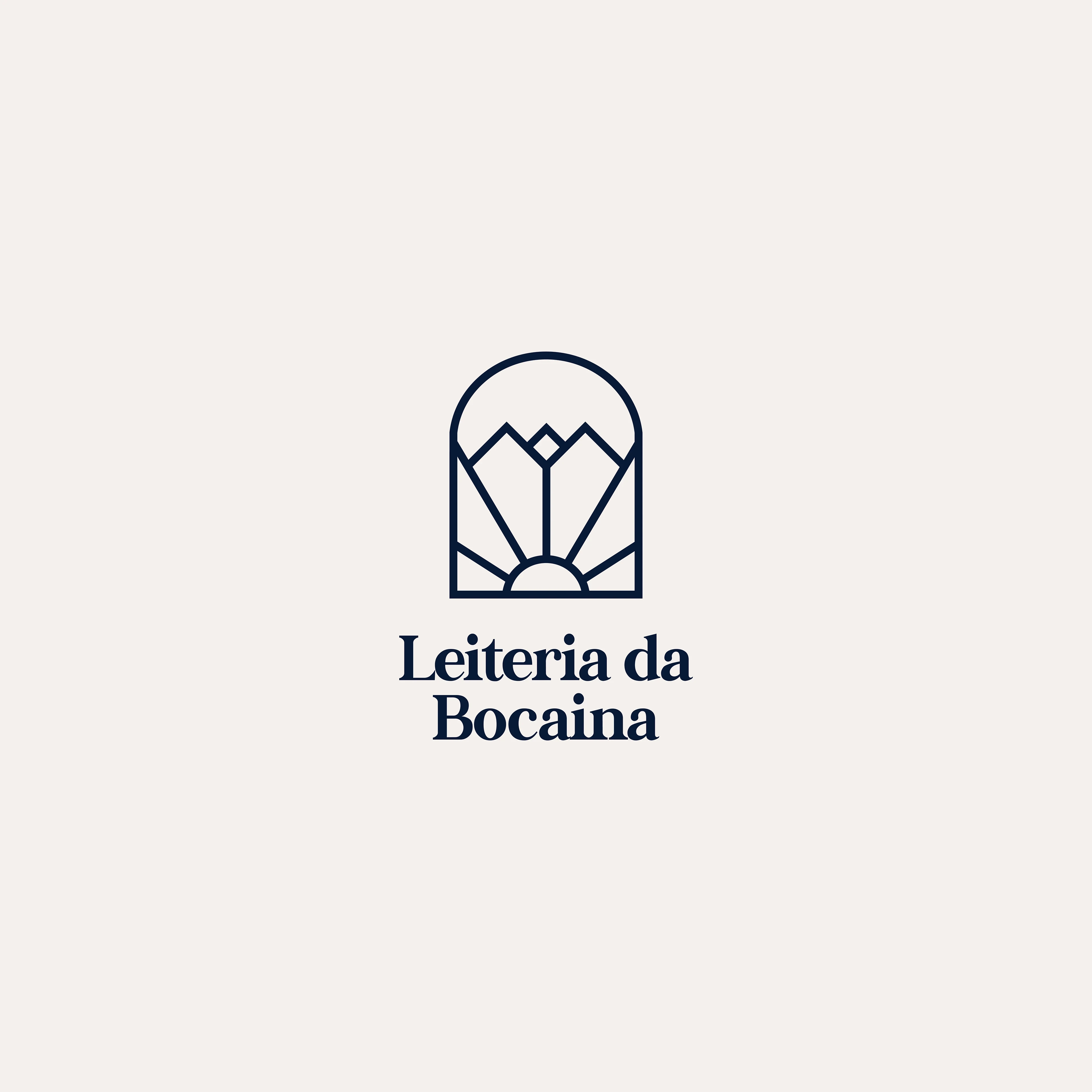
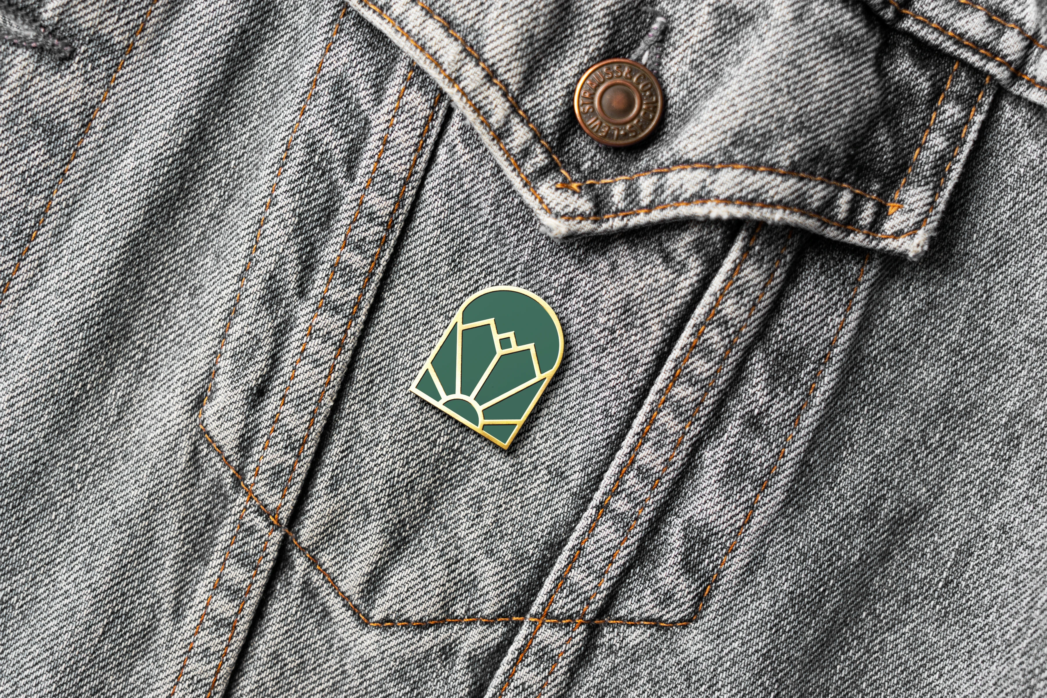
Areias is a colonial town, and its architecture carries a specific detail: the arched windows, framed in stone, that repeat down every street. That arch became the container for the mark. Inside it, a simplified landscape of the Serra, the hills the cheese comes from.
The logo is a window looking out at the place that makes the product.
System
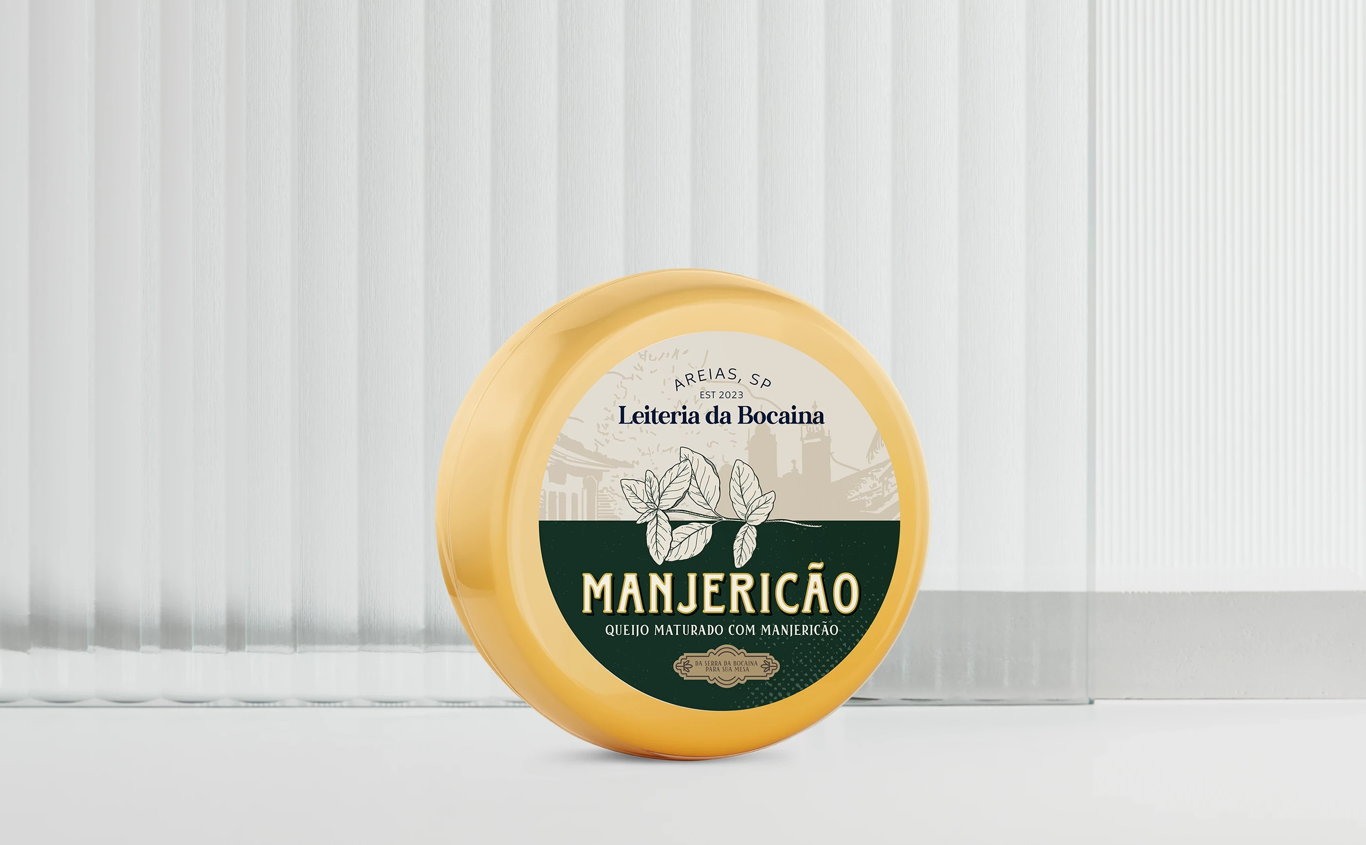
The identity runs on warm neutrals and a deep green pulled from the landscape, with typography that sits between a colonial letterpress and something contemporary enough to read cleanly at small sizes. The system extends into product labels, seals, stamps, and merchandise, each application built to work in print on textured, uncoated stock rather than on screen.

Leiteria da Bocaina
Rebranding and packaging for an artisanal cheese producer, built from the windows of the town.
Client:
Leiteria da Bocaina
Categories:
Identity & Branding
,
Packaging
Timeline:
2 Weeks
Context
Leiteria da Bocaina makes cheese in Areias, a small town in the Serra da Bocaina, in the interior of São Paulo. The production is artisanal and slow, the kind where the same family handles every stage. What they had was a product people already loved and a brand that did not look like the thing inside the package.
Challenge
Artisanal food brands tend to fall into one of two traps. They either look so rustic that they read as amateur, or they modernize so hard that they lose the reason anyone wanted them in the first place. This one needed both at once: the weight of something made by hand, and enough presence to hold its own on a shelf next to industrial competitors.
Approach
I went looking for the place before I went looking for the brand.
Areias is a colonial town, and its architecture carries a specific detail: the arched windows, framed in stone, that repeat down every street. That arch became the container for the mark. Inside it, a simplified landscape of the Serra, the hills the cheese comes from.
The logo is a window looking out at the place that makes the product.
System
The identity runs on warm neutrals and a deep green pulled from the landscape, with typography that sits between a colonial letterpress and something contemporary enough to read cleanly at small sizes. The system extends into product labels, seals, stamps, and merchandise, each application built to work in print on textured, uncoated stock rather than on screen.
Other Projects
Other Projects
Let’s Discuss
Planning a project?
tell us about it.
Leiteria da Bocaina
Leiteria da Bocaina
Rebranding and packaging for an artisanal cheese producer, built from the windows of the town.
Rebranding and packaging for an artisanal cheese producer, built from the windows of the town.
Client:
Leiteria da Bocaina
Categories:
Identity & Branding
,
Packaging
Timeline:
2 Weeks
Context
Leiteria da Bocaina makes cheese in Areias, a small town in the Serra da Bocaina, in the interior of São Paulo. The production is artisanal and slow, the kind where the same family handles every stage. What they had was a product people already loved and a brand that did not look like the thing inside the package.
Challenge
Artisanal food brands tend to fall into one of two traps. They either look so rustic that they read as amateur, or they modernize so hard that they lose the reason anyone wanted them in the first place. This one needed both at once: the weight of something made by hand, and enough presence to hold its own on a shelf next to industrial competitors.
Approach
I went looking for the place before I went looking for the brand.
Areias is a colonial town, and its architecture carries a specific detail: the arched windows, framed in stone, that repeat down every street. That arch became the container for the mark. Inside it, a simplified landscape of the Serra, the hills the cheese comes from.
The logo is a window looking out at the place that makes the product.
System
The identity runs on warm neutrals and a deep green pulled from the landscape, with typography that sits between a colonial letterpress and something contemporary enough to read cleanly at small sizes. The system extends into product labels, seals, stamps, and merchandise, each application built to work in print on textured, uncoated stock rather than on screen.
Other Projects
Other Projects
Let’s Discuss