Maia | Bittencourt
Brand identity for an architecture studio founded by two partners, built on the line that joins them.
Client:
Maia | Bittencourt Arquitetos
Categories:
Visual Identity
,
Brand System
Context
Maia | Bittencourt is an architecture studio founded by two architects joining forces. They wanted a studio, not a firm, and they needed a full visual identity from scratch, with no existing brand assets and a two week window before their first client presentations.
Challenge
Two founders, two creative points of view. They shared a core: minimalism, restraint, and a strong preference for warm neutrals, which ran through every reference they brought. But they read that shared ground differently. The identity had to hold both without settling into a compromise neither of them recognized.
Approach
Every architecture project starts with a line.

A line divides a space. A line becomes a wall. A line becomes a piece of furniture. And when two lines meet, they make form, and form becomes matter.
That gave the studio's founding condition a shape: two people meeting to build something. The identity is the expression of that matter.
The idea resolves in a single character. The vertical rule between the two names in the wordmark is not a separator. It is the line that joins them.
System
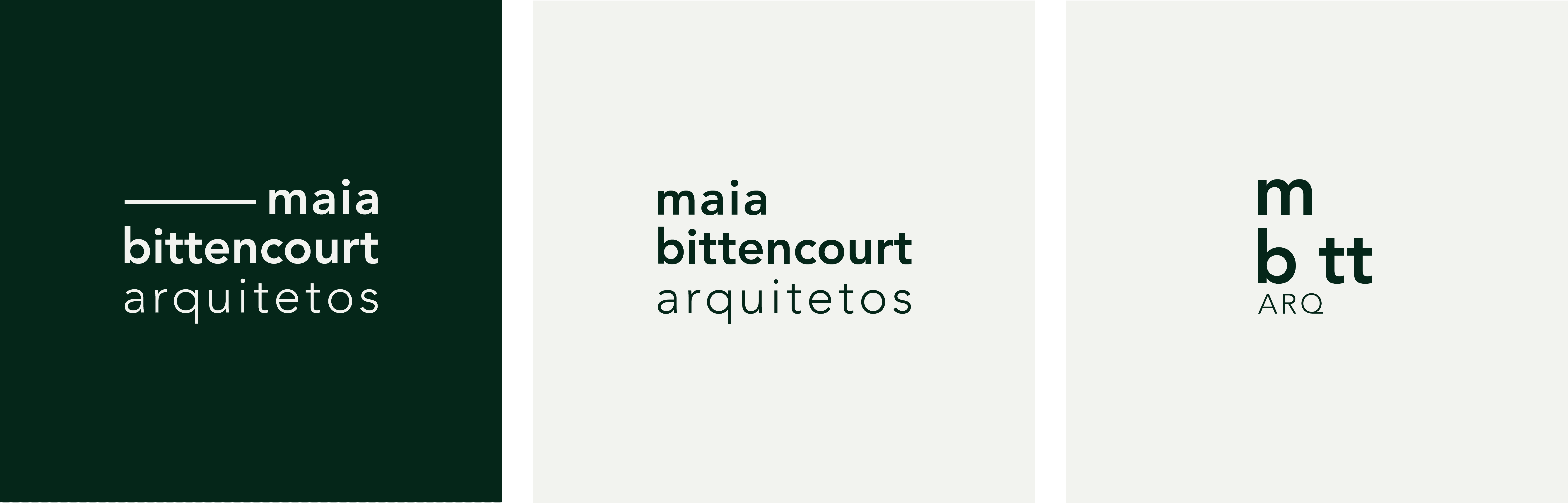
The wordmark carries the concept in its structure. Both surnames sit in a heavier weight; "arquitetos" sits light beneath them, because the people come before the profession. A stacked monogram handles compact and digital use, where the line reappears as a horizontal rule.
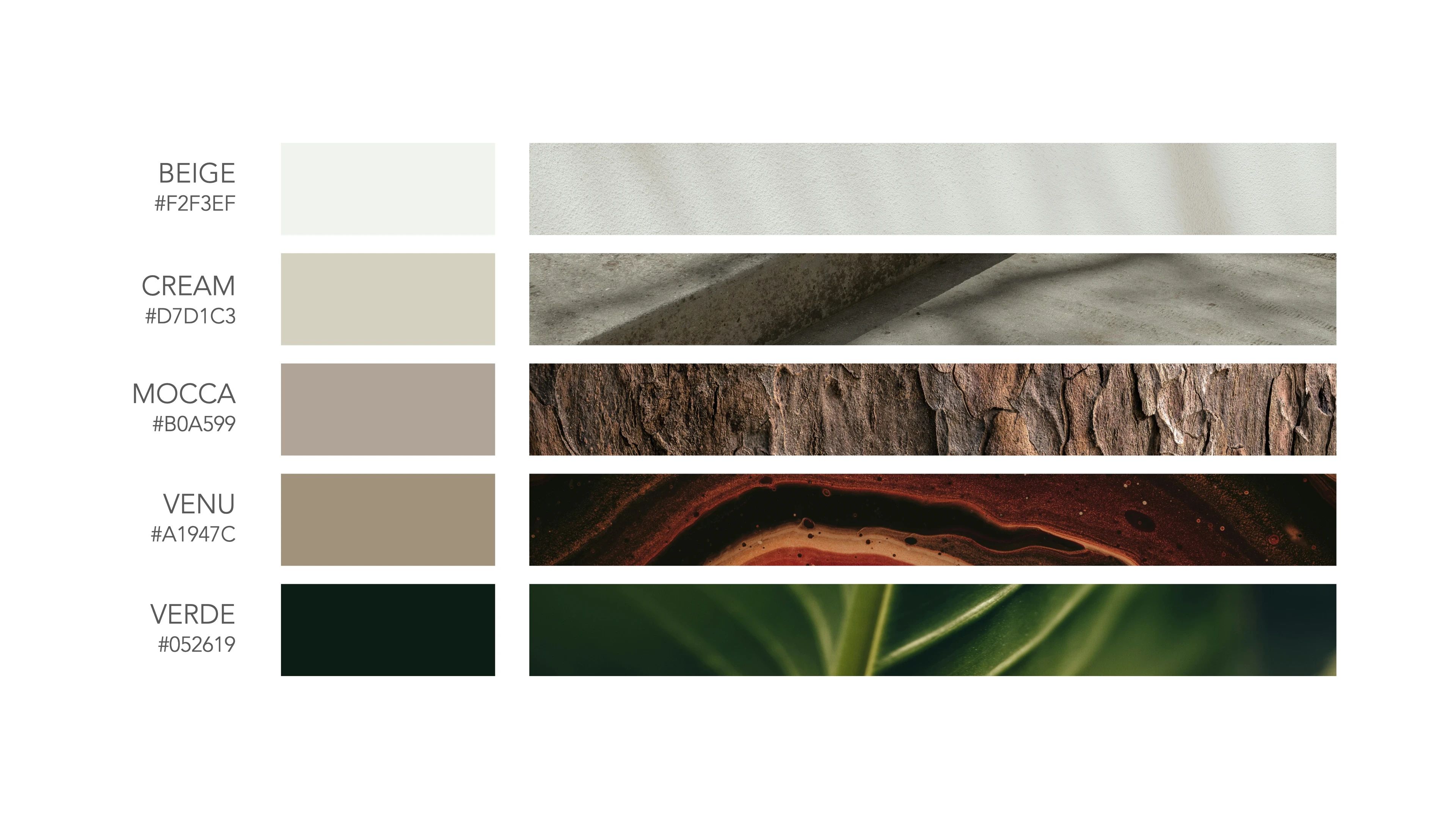
The palette translates the founders' own references and the studio's core materials into color: wood for warmth, concrete for permanence, paint for finish. Warm neutrals carry the system, with a deep green anchoring contrast.
Outcome
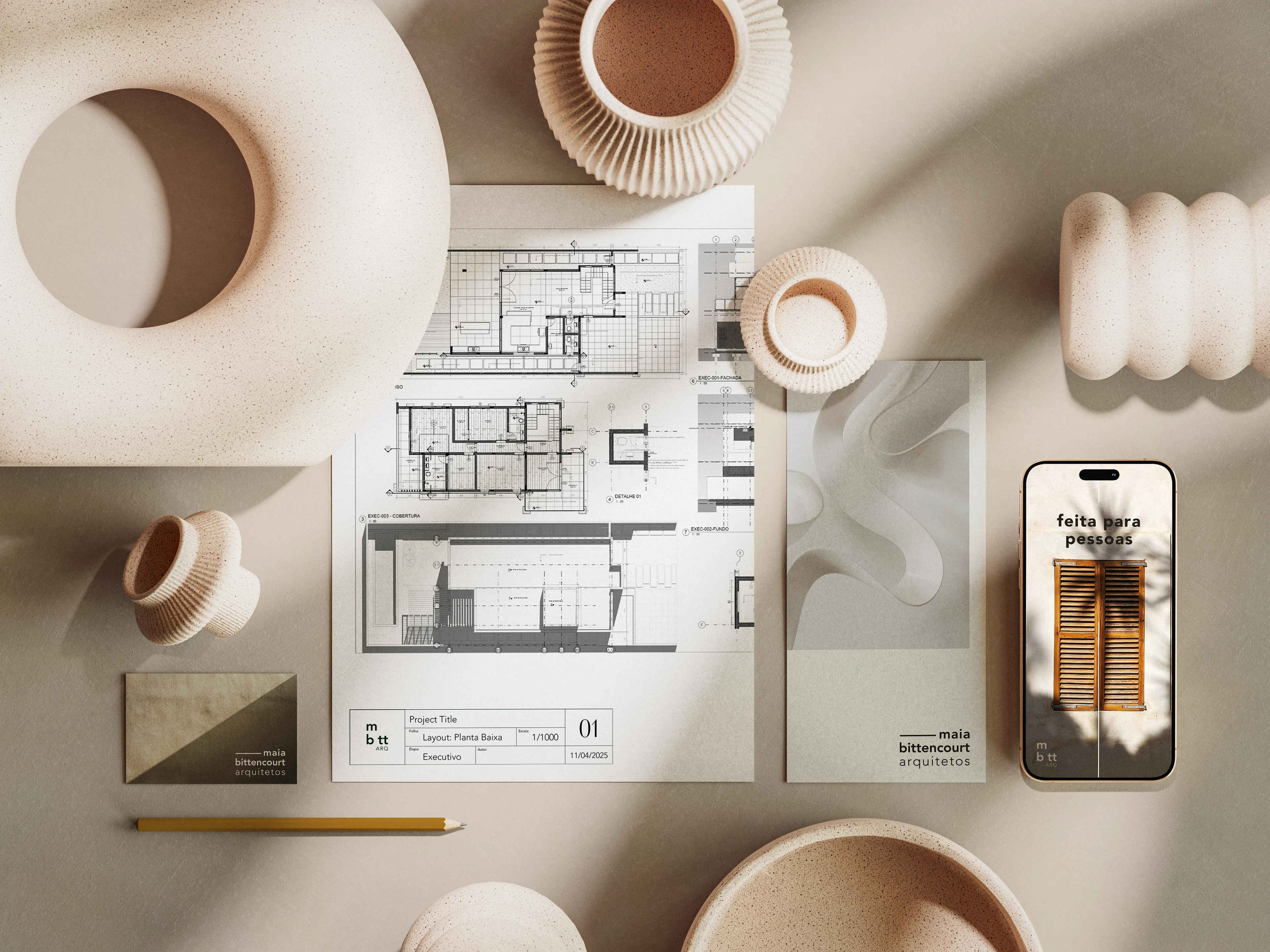
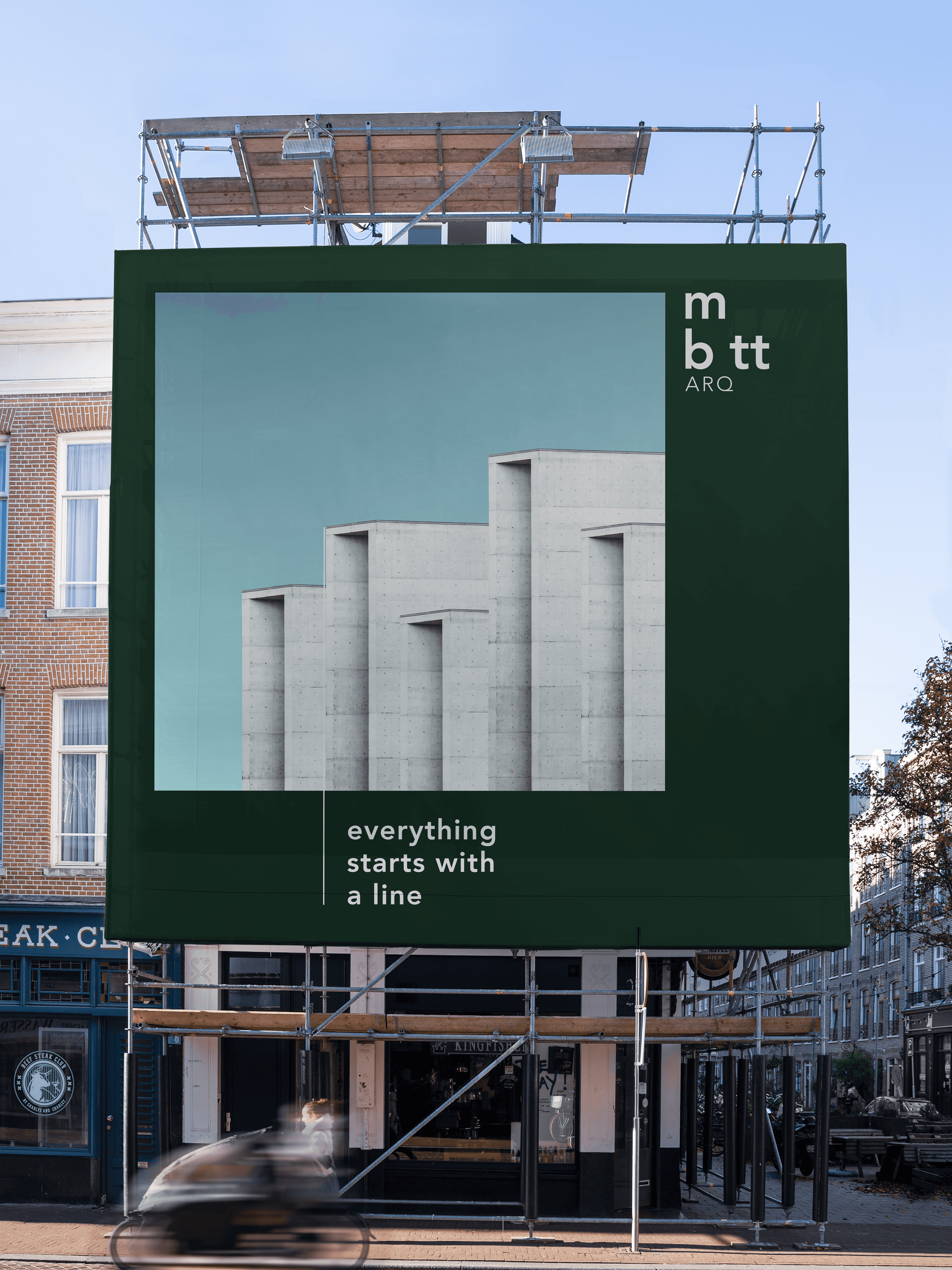
Delivered in two weeks: full logo suite, type system, color system, and applications across stationery, technical drawings, and digital touchpoints.


Maia | Bittencourt
Brand identity for an architecture studio founded by two partners, built on the line that joins them.
Client:
Maia | Bittencourt Arquitetos
Categories:
Visual Identity
,
Brand System
Timeline:
2 Weeks
Context
Maia | Bittencourt is an architecture studio founded by two architects joining forces. They wanted a studio, not a firm, and they needed a full visual identity from scratch, with no existing brand assets and a two week window before their first client presentations.
Challenge
Two founders, two creative points of view. They shared a core: minimalism, restraint, and a strong preference for warm neutrals, which ran through every reference they brought. But they read that shared ground differently. The identity had to hold both without settling into a compromise neither of them recognized.
Approach
Every architecture project starts with a line.
A line divides a space. A line becomes a wall. A line becomes a piece of furniture. And when two lines meet, they make form, and form becomes matter.
That gave the studio's founding condition a shape: two people meeting to build something. The identity is the expression of that matter.
The idea resolves in a single character. The vertical rule between the two names in the wordmark is not a separator. It is the line that joins them.
System
The wordmark carries the concept in its structure. Both surnames sit in a heavier weight; "arquitetos" sits light beneath them, because the people come before the profession. A stacked monogram handles compact and digital use, where the line reappears as a horizontal rule.
The palette translates the founders' own references and the studio's core materials into color: wood for warmth, concrete for permanence, paint for finish. Warm neutrals carry the system, with a deep green anchoring contrast.
Outcome
Delivered in two weeks: full logo suite, type system, color system, and applications across stationery, technical drawings, and digital touchpoints.
Other Projects
Other Projects
Maia | Bittencourt
Brand identity for an architecture studio founded by two partners, built on the line that joins them.
Client:
Maia | Bittencourt Arquitetos
Categories:
Visual Identity
,
Brand System
Timeline:
2 Weeks
Context
Maia | Bittencourt is an architecture studio founded by two architects joining forces. They wanted a studio, not a firm, and they needed a full visual identity from scratch, with no existing brand assets and a two week window before their first client presentations.
Challenge
Two founders, two creative points of view. They shared a core: minimalism, restraint, and a strong preference for warm neutrals, which ran through every reference they brought. But they read that shared ground differently. The identity had to hold both without settling into a compromise neither of them recognized.
Approach
Every architecture project starts with a line.
A line divides a space. A line becomes a wall. A line becomes a piece of furniture. And when two lines meet, they make form, and form becomes matter.
That gave the studio's founding condition a shape: two people meeting to build something. The identity is the expression of that matter.
The idea resolves in a single character. The vertical rule between the two names in the wordmark is not a separator. It is the line that joins them.
System
The wordmark carries the concept in its structure. Both surnames sit in a heavier weight; "arquitetos" sits light beneath them, because the people come before the profession. A stacked monogram handles compact and digital use, where the line reappears as a horizontal rule.
The palette translates the founders' own references and the studio's core materials into color: wood for warmth, concrete for permanence, paint for finish. Warm neutrals carry the system, with a deep green anchoring contrast.
Outcome
Delivered in two weeks: full logo suite, type system, color system, and applications across stationery, technical drawings, and digital touchpoints.
Let’s Discuss