Onboarding that converts
From 20% to 89% assessment pass rate Designing the visual system that turned dense AI training content into contributor activation.
Client:
AI Research Company
Categories:
Learning Experience Design
,
Design Systems
Designing the visual system that turned dense AI training content into contributor activation.
The large-scale AI company training programs runs large-scale AI training programs staffed by specialized contributors - people with real domain expertise, recruited to perform complex tasks on the platform. Getting them productive is expensive. Onboarding is where that investment either converts or evaporates.
I joined the Enablement team as the graphic and visual designer, embedded with instructional designers, researchers, product, and operations.
The system
A slide bank of 99+ components, and the library around it.
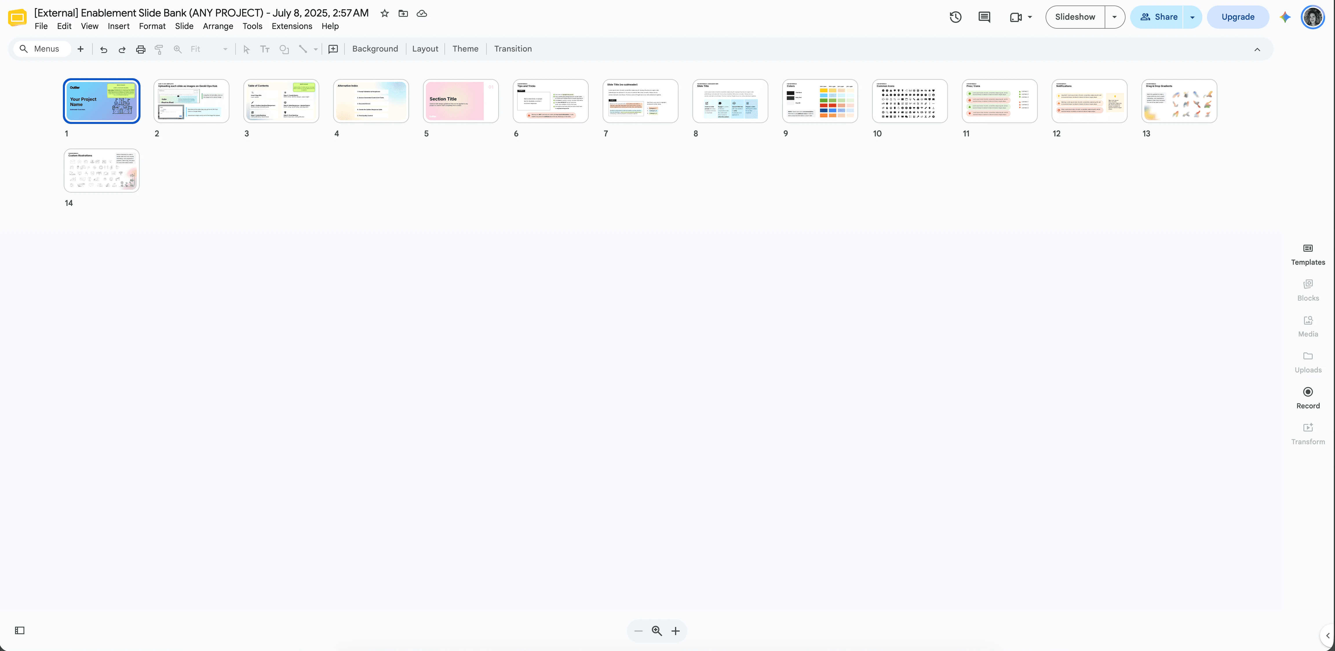
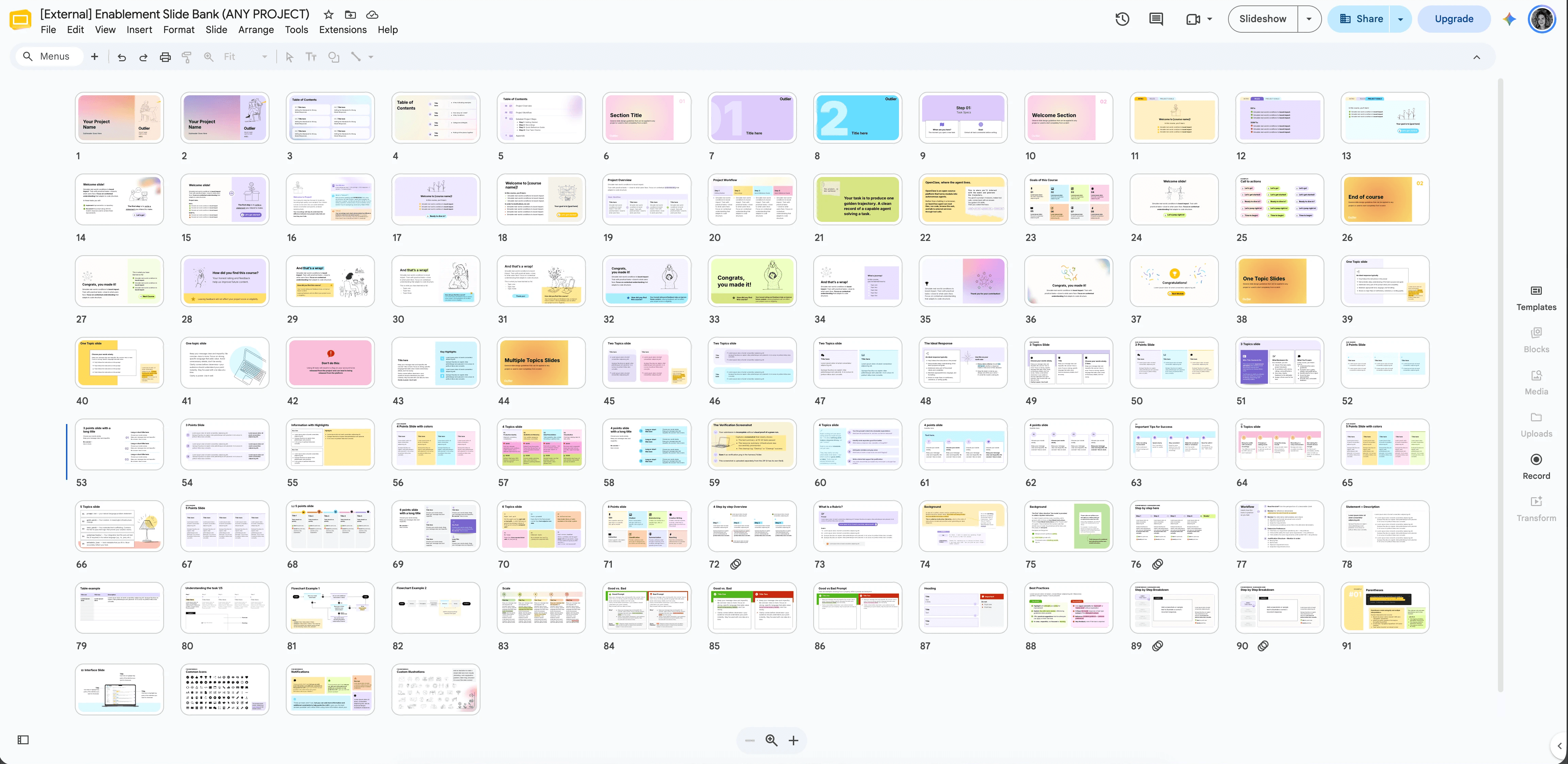
Corporate brand standards existed as a PDF. They didn't exist as something a non-designer could build with at 6pm before a launch. I turned them into a working system in PowerPoint and Google Slides: modular layouts, diagram patterns, data treatments, and iconography, built so instructional designers could assemble a course without me in the room.
The tool
Then we automated the part that shouldn't need a designer.
Guidelines documents were being assembled by hand, every time, from the same underlying pieces. Working with a developer on the team, I designed an internal AI tool that generates them, defining the interface, the input flow, and the output structure so the results came out consistent with the system rather than adjacent to it.
The narrative
Sometimes I could change the words. When I couldn't, I changed the pacing.
Training content arrives as text. Long, technical, correct, and unreadable at the volume required. Where I had editorial latitude, I proposed structural changes to the content itself. Where I didn't, I worked on rhythm, breaking a single dense block into a visual sequence, so attention had somewhere to land and the reader never faced a wall.
The channel
Support topics, rebuilt as video.
Recurring questions were being answered one ticket at a time. I designed and produced narrated video walkthroughs for the highest-volume topics - for internal courses and for the support team.
The onboarding drop
Onboarding completion was falling. Contributors were reaching the task and not knowing what to do with it - the training explained the concept but not the execution. These are specialized, hard-to-recruit contributors, so every one who stalls is a hiring investment that never reaches productive work.
The Enablement team rebuilt the path end to end. On the design side: restructuring the sequence so instruction arrived immediately before the moment of use, replacing description with demonstration, and cutting the distance between "read this" and "do this."
Assessment pass rate moved from 20% to 89%.
Results
Assessment pass rate: 20% → 89% on the rebuilt onboarding program
Support dependency reduced by up to 95%
Assessment completion time reduced by over an hour, activation up 190%
Activation up to 400% and completion up to 3x on narrated learning experiences
Team outcomes across Enablement initiatives. Design contributed alongside content, research, and instructional strategy.
Branding makes people feel something. This work made people able to do something.

Onboarding that converts
From 20% to 89% assessment pass rate Designing the visual system that turned dense AI training content into contributor activation.
Client:
AI Research Company
Categories:
Learning Experience Design
,
Design Systems
Timeline:
Jun 2025 - present
Designing the visual system that turned dense AI training content into contributor activation.
The large-scale AI company training programs runs large-scale AI training programs staffed by specialized contributors - people with real domain expertise, recruited to perform complex tasks on the platform. Getting them productive is expensive. Onboarding is where that investment either converts or evaporates.
I joined the Enablement team as the graphic and visual designer, embedded with instructional designers, researchers, product, and operations.
The system
A slide bank of 99+ components, and the library around it.
Corporate brand standards existed as a PDF. They didn't exist as something a non-designer could build with at 6pm before a launch. I turned them into a working system in PowerPoint and Google Slides: modular layouts, diagram patterns, data treatments, and iconography, built so instructional designers could assemble a course without me in the room.
The tool
Then we automated the part that shouldn't need a designer.
Guidelines documents were being assembled by hand, every time, from the same underlying pieces. Working with a developer on the team, I designed an internal AI tool that generates them, defining the interface, the input flow, and the output structure so the results came out consistent with the system rather than adjacent to it.
The narrative
Sometimes I could change the words. When I couldn't, I changed the pacing.
Training content arrives as text. Long, technical, correct, and unreadable at the volume required. Where I had editorial latitude, I proposed structural changes to the content itself. Where I didn't, I worked on rhythm, breaking a single dense block into a visual sequence, so attention had somewhere to land and the reader never faced a wall.
The channel
Support topics, rebuilt as video.
Recurring questions were being answered one ticket at a time. I designed and produced narrated video walkthroughs for the highest-volume topics - for internal courses and for the support team.
The onboarding drop
Onboarding completion was falling. Contributors were reaching the task and not knowing what to do with it - the training explained the concept but not the execution. These are specialized, hard-to-recruit contributors, so every one who stalls is a hiring investment that never reaches productive work.
The Enablement team rebuilt the path end to end. On the design side: restructuring the sequence so instruction arrived immediately before the moment of use, replacing description with demonstration, and cutting the distance between "read this" and "do this."
Assessment pass rate moved from 20% to 89%.
Results
Assessment pass rate: 20% → 89% on the rebuilt onboarding program
Support dependency reduced by up to 95%
Assessment completion time reduced by over an hour, activation up 190%
Activation up to 400% and completion up to 3x on narrated learning experiences
Team outcomes across Enablement initiatives. Design contributed alongside content, research, and instructional strategy.
Branding makes people feel something. This work made people able to do something.
Other Projects
Other Projects
Let’s Discuss
Planning a project?
tell us about it.
Onboarding that converts
Onboarding that converts
From 20% to 89% assessment pass rate Designing the visual system that turned dense AI training content into contributor activation.
From 20% to 89% assessment pass rate Designing the visual system that turned dense AI training content into contributor activation.
Client:
AI Research Company
Categories:
Learning Experience Design
,
Design Systems
Timeline:
Jun 2025 - present
Designing the visual system that turned dense AI training content into contributor activation.
The large-scale AI company training programs runs large-scale AI training programs staffed by specialized contributors - people with real domain expertise, recruited to perform complex tasks on the platform. Getting them productive is expensive. Onboarding is where that investment either converts or evaporates.
I joined the Enablement team as the graphic and visual designer, embedded with instructional designers, researchers, product, and operations.
The system
A slide bank of 99+ components, and the library around it.
Corporate brand standards existed as a PDF. They didn't exist as something a non-designer could build with at 6pm before a launch. I turned them into a working system in PowerPoint and Google Slides: modular layouts, diagram patterns, data treatments, and iconography, built so instructional designers could assemble a course without me in the room.
The tool
Then we automated the part that shouldn't need a designer.
Guidelines documents were being assembled by hand, every time, from the same underlying pieces. Working with a developer on the team, I designed an internal AI tool that generates them, defining the interface, the input flow, and the output structure so the results came out consistent with the system rather than adjacent to it.
The narrative
Sometimes I could change the words. When I couldn't, I changed the pacing.
Training content arrives as text. Long, technical, correct, and unreadable at the volume required. Where I had editorial latitude, I proposed structural changes to the content itself. Where I didn't, I worked on rhythm, breaking a single dense block into a visual sequence, so attention had somewhere to land and the reader never faced a wall.
The channel
Support topics, rebuilt as video.
Recurring questions were being answered one ticket at a time. I designed and produced narrated video walkthroughs for the highest-volume topics - for internal courses and for the support team.
The onboarding drop
Onboarding completion was falling. Contributors were reaching the task and not knowing what to do with it - the training explained the concept but not the execution. These are specialized, hard-to-recruit contributors, so every one who stalls is a hiring investment that never reaches productive work.
The Enablement team rebuilt the path end to end. On the design side: restructuring the sequence so instruction arrived immediately before the moment of use, replacing description with demonstration, and cutting the distance between "read this" and "do this."
Assessment pass rate moved from 20% to 89%.
Results
Assessment pass rate: 20% → 89% on the rebuilt onboarding program
Support dependency reduced by up to 95%
Assessment completion time reduced by over an hour, activation up 190%
Activation up to 400% and completion up to 3x on narrated learning experiences
Team outcomes across Enablement initiatives. Design contributed alongside content, research, and instructional strategy.
Branding makes people feel something. This work made people able to do something.
Other Projects
Other Projects
Let’s Discuss